Over the past few years, I have been tweeting and posting messages on social media platforms about air quality and pollution issues around the globe and I have noticed that the more severe the message the greater the response from people (likes and/or retweets). The same technique is being used by newspapers and magazines to achieve greater impact.Read More »
Here are all the available IAQ Monitors on the market. This time and after your help I have included many more information in a Google Spreadsheet document which you are going to appreciate a lot, such as website links and whether the device has been reviewed on my blog or not yet. There are so many devices out there but they all lack innovation and they all offer exactly the same technologies. Companies had better hear users feedback!
A USA air quality monitor in comparison with a DIY German air quality monitor. How well do they perform with each other? Full disclosure, the software the monitors run is developed in the mentioned countries. The components from both devices are made mostly in China.
We already know PA-II’s correlation of coenficency R²≈0.87 with the corresponding FEM GRIMM and FEM BAM.
The SDS011 sensor which is most commonly used in the Luftdaten project has a correlation of coenficency R²≈0.84.
The PA-II features a double PMS5003 laser sensor. The PA-II module averages out the values from the two sensors, so in case one of the two sensors registers unexpected high readings, (perhaps some dust or insects etc) this technique makes the readings less questionable. The Luftdaten DIY project as we have mention above mostly uses one SDS011 laser sensor. However, the Luftdaten software supports many PM2.5 sensors including the PMS5003 series among others.
Analysis
My friend Ashley from Plume Plotter has already done a comparison between the Purple Air PA-II, the Luftdaten SDS011 and DEFRA for a complete year of data link.
First of all, by comparing PA-II’s two identical sensors we can see on the graph below that the Sensor B has the tendency to register higher concentrations over time, on my device, maybe another device has a different behavior. So the process of averaging out the concentrations from both sensors has some positive results.
Many scientific papers insist that the PMS5003 and SDS011 sensors are nephelometers and not particle counters. Which means that they are influenced by humidity. Nephelometer comes from the compound Greek word nephelo “Νέφος” which means cloud.
I live in an area with high humidity. Right now the official RH is 83%. The PA-II registers 51.6μg/m3 and Luftdaten 38.3μg/m3. The difference between them is huge. However, both devices are mistaken. Purely for your information the humidity sensor in the Luftdaten device measured RH 94% the PA-II measured RH 53% and AirVisual measured RH 72%. From my experience, I would say that the relative humidity is definitely above 80%.
From the graph below we can see the same results. The PM-II overestimates the PM2.5 concentrations most of the time in comparison with the Lufdaten sensor. Both devices seem to measure the same fluctuations over time so there is some correlation. The humidity that day started low at RH 30% and climbed up to 60% at the end of the day. There is an influence between humidity and how the sensors and especially the PA-II measure PM2.5 concentrations without any doubt.
SeeTheAir: 24h PA-II & Luftdaten side by side
Conclusion
The conclusion that I get from my everyday readings having the two devices side by side and from Plume Plotter’s analysis is that the PA-II overestimates the PM2.5 concentrations especially when relative humidity is above ~55% while the Luftdaten’s readings are more adjacent to the official readings.
Plume Plotte: Regression lines for Luftdaten sensor and Purple Air PA-II sensor readings vs. actual (reference instrument) concentrations.
A reader of the blog took the initiative to establish a contact between PurpleAir and me, as a result the PurpleAir II outdoor Particulate Matter monitor is here for a review. Thank you Daniel.
The monitor is very compact and it can be easily distinguished from the rest because it has 2 Particulate Matter sensors. Both of them work together to establish better results and a coefficient of determination (R²).Read More »
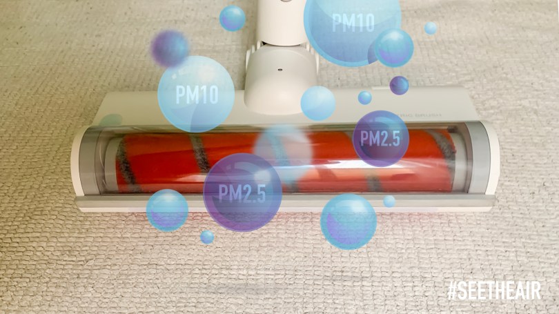
We all enjoy a clean and cosy house free from dust and pollutants. Unfortunately, sometimes we commit serious mistakes when it comes to the decisions we take and the ways we choose to clean it. One of the most common mistakes is using vacuum cleaners that don’t have a HEPA filter. We already know how dangerous are PM2.5 particles because they can penetrate deeply inside our bodies and affect our lungs, heart and even our brains.
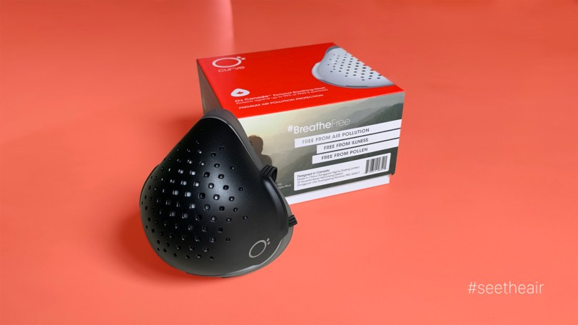
Have you ever wondered which respirator can achieve the best insulation around your face? In my research for a respirator mask that won’t allow any leakage, I think I found a pretty good one, the O2 Canada Respirator.
AQI stands for Air Quality Index and it is the number or colour that indicates how good or bad is the air quality in your area. The problem with the AQI is the way each governments calculates the air pollution and what parameters it uses to project this Index number/colour. For example, the USA Environmental Protection Agency (EPA) considers as breakpoint for a “Moderate” NO2 concentration the value of 101μg/m3, but the UK Department for Environment, Food & Rural Affairs (DEFRA) considers as breakpoint for a “Moderate” NO2 concentration the value of 201μg/m3. The difference is huge and the Index changes dramatically for each country and at the end people get confused. The same rule applies for all the pollutants, PM2.5, SO2, O3, etc… Later they are combined all together to give us the final Index.
AQLI stands for Air Quality Life Index and only take into account the PM2.5 pollution. It is based on the finding that an additional 10μg/m3 of PM2.5 reduces life expectancy by 0.98 years. By combining this finding with satellite PM2.5 measurements around the world, the AQLI provides an insight into the global impacts of particulate pollution in local jurisdictions. The Index also illustrates how air pollution policies can increase life expectancy if pollution levels were reduced to the World Health Organization’s (WHO) safe guideline or existing national air quality standards, or by user-selected percent reductions.
Could the AQLI replace the different AQIs worldwide?
Although it gives a better insight into the impact the air pollution has to our lives, it will not be able to convince people in countries where the impact of air pollution doesn’t translate to high “Life Years Saved” numbers. For example, we can clearly see from the table below that if China adjusts their policies according to the WHO Guideline the population will have a benefit of 2.9 years. However, if Netherlands adjusts their policies according to the WHO Guideline the population will have a benefit of 0.3 years. This is rather a small number and I am afraid people won’t take it as serious in western countries as they should. In my opinion the AQLI has to take into account how our quality of life (not only life expectancy) is affected by the air pollution. We may live longer but sometimes inside hospitals, under expensive insurances and medicines that not everyone can afford even in US, Europe, etc.
Moreover, the data that you see on the table above (extracted from the original document which you can find below) do not reflect the real air quality an individual has been exposed in his a city/town/village. They have created an annual average PM2.5 concentration and the aggregations are population-weighted, which means this map won’t help an individual to understand the air quality in his/her area. For instance, there is a small town in my region called Carboneras, the population is small but there is a coal power plant there (equipped with 48 coal burners). People’s life expectancy from that village won’t reflect on the annual PM2.5 concentration because the populations is small.
I really admire this exceptional work which is done by Michael Greenstone and Qing (Claire) Fan because we need a global way to understand the air pollition and its effects. They have developed a tool which can help to inform local communities and policymakers in Asian countries about the benefits of air pollution policies in very detailed way.
Here is an interesting new face mask made and assembled 100% in Europe by a Spanish company. The AirGO offers 2 unique features that makes it very alluring to purchase and use it everyday, while you work out or commute to work.
Holidays are coming, with spare time to read some great books or give them away as a gift. It doesn’t matter which one you will choose mine, Rieuwerts’, Fuller’s or all of them, just make sure you learn more about the air you breathe. Share with your loved ones and friends the knowledge you will get.