R Studio and its packages are used by hundreds of thousands of people to make millions of plots. I use it to compare air sensor data from different air quality monitors/sensors or to visualize air pollution levels.
In this article we will explore both how we can visualize air quality data from publicly available sources and how you can create statistical correlations between different pollutants or different sensors to find the correlation coefficient or correlation of determination.
First: Get the Right Packages
Packages are collections of functions, data, and compiled code in a well-defined format, created to add specific functionality. Here are some of the packages that we will install inside RStudio and use.
#You can either get ggplot2 by installing the whole tidyverse library
install.packages(tidyverse)

#Alternatively, install just ggplot2
install.packages(ggplot2)

#saqgetr is a package to import European air quality monitoring data in a fast and easy way
install.packages(saqgetr)

#worldmet provides an easy way to access data from the NOAA Integrated Surface Database
install.packages(worldmet)

#Date-time data can be frustrating to work with in R and lubridate can help us fix possible issues
install.packages(lubridate)

#Openair is a package developed for the purpose of analysing air quality data
linstall.packages(openair)
Second: Load the Packages
Once we have installed the packages we need to enable them. We need to do the same thing each time we close and open RStudio.
library(saqgetr)
library(tidyverse)
library(worldmet)
library(lubridate)
library(openair)
Third: Get your Air Quality Data
Whether you want to use your data from your hard drive or get data from online platforms, here are two examples.
#Load CSV data file from the hard drive
AQData <- read.csv("/Users/Downloads/AQData.csv", header = FALSE, sep=",", stringsAsFactors=FALSE)

#Get data from the European network of air quality stations, e.g. Almeria Mediterraneo ES1393A, the UK uses the AURN network
AQDataAlmeria <- importEurope(site = "ES1393A", year = c(2012:2024))
LondonAQ <- importAURN(site = "MY1", year = 2023)
WeatherData <- importNOAA(code = "036580-99999", year = 2023)

#View AQ dataframe
data(AQData)
data(AQDataAlmeria)
Forth: Clean Your Data
Unfortunately, sometimes we need to clean our data in order for R to understand the different columns, dates, and values. Here are some of the most common commands that I use especially for data that I get from personal air quality monitors.
#sometimes CSV tables are not well named once imported into R and come with V1, V2, V3,.... This command will remove the V1,V2,V3,... and replace them with the first row that most likely would be date, PM2.5, PM10, Temperature, etc.
names(AQData) <- AQData[1,]
AQData <- AQData[-1,]

#We can fix date format with this command. Make sure you use the ISO 8601 format and you have a column with the name "date" at it will help us later on.
AQData <- ymd_hms(AQData, tz = "UTC")

#Sometimes columns inside the dataframes are not recognized as number but as text. This command will make them numbers.
AQData$PM2.5 <- as.numeric(AQData$PM2.5)

# merge AQ and Weather data
AQWeather <- inner_join(select(AQWeather, -ws, -wd),  WeatherData,  by = "date")

#Use this command to check the class of the column.
class(AQData$PM2.5)
Fifth: Time to Visualize Air Quality
Frequently, I use openair and ggpubr aka ggplot2. ggpubr is a package that creates “wrappers” for much of ggplot2’s core functionality and it makes life a bit easier. They have a vast variety of visualization plots. Here are some examples.
#general plot all the available data using the openair package
summaryPlot(AQData)
#we can specify dates and average values
summaryPlot(selectByDate(AQData, year = c(2019:2023)), type = "density", avg.time = "12 hour")

#specific month
summaryPlot(selectByDate(AQData, month = 7), period = "months", type = "density")

#specific dates
summaryPlot(selectByDate(AQData, day = c(1:10)), period = "days", type = "density")
#plot with instruction on how the data are split and correlation determination(r2) values
scatterPlot(AQData, x= "nox", y= "no2", type = c("season"), linear = TRUE)
#powerful way to plots the diurnal, day of the week and monthly variation for different pollutants
timeVariation(AQData, pollutant = "no2", local.tz = "Europe/Madrid")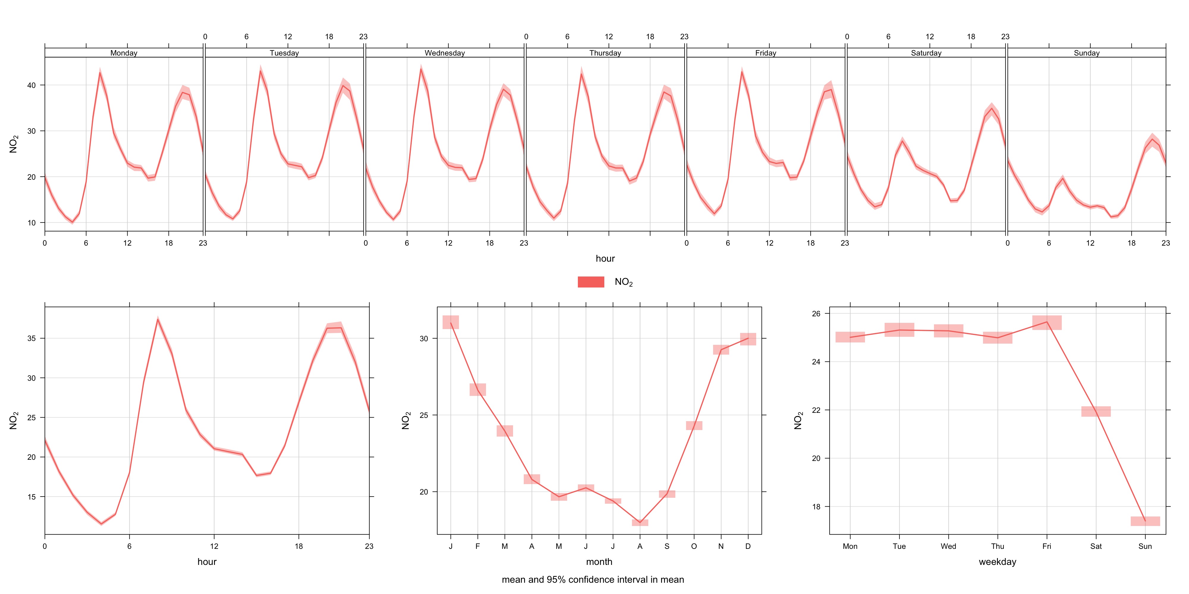
#an other way to see concentrations of pollutants on a calendar
trendLevel(AQData, pollutant = "no2")
#great way to see which dates of a calendar year pollutants surpassed the limits by creating breakpoints
trendLevel(AQData, pollutant = "no2",
breaks = c(0, 40, 500),
labels = c("0 to 40", ">40"),
cols = c("turquoise4", "deeppink"), border = "white")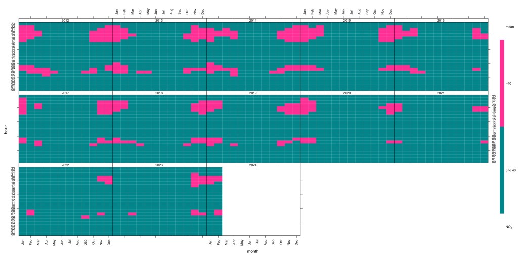
#classical calendar plot
calendarPlot(AQData, pollutant = "no2", year = "2023", main = "NO2")
#overall pollution reduction visualization over long periods
smoothTrend(AQData, pollutant = "no2", deseason = TRUE)
Let’s see same examples with the ggpubr/ggplot2 packages. These packages allows us to create layers and add many elements into the visualization. Here is the basic configuration I use to compare a low-cost sensor with a reference sensor.
#Plot correlation coefficient with Values
ggscatter(AQData, x = "LCPM2.5", y = "BAMPM2.5",
add = "reg.line", conf.int = TRUE,
add.params = list(color = "blue", fill = "lightgray"),
cor.coef = TRUE, cor.method = "pearson",
xlab = "Low-Cost PM2.5", ylab = "BAM PM2.5")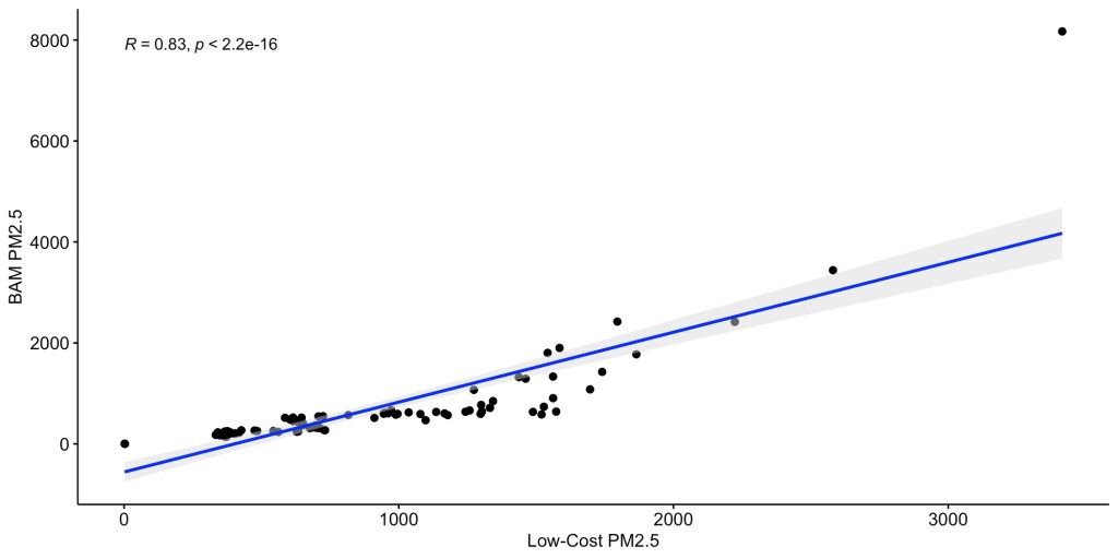
I recommend to download and read the ggplot2 CHEATSHEET. It will help you understand better the capabilities of the package and it is done nicely.

Discover more from See The Air
Subscribe to get the latest posts sent to your email.

All our scientists at AirGradient are also big fans of R and it’s indeed a very powerful tool to analyze air quality data.
LikeLiked by 1 person
Hola Sotirios!! qué interesante!! Está genial! Saludos, María ________________________________
LikeLiked by 1 person
[…] and secure within your own home network. Users can download their data for further analysis with RStudio, MS Excel, […]
LikeLike
saqgetr was discontinued in February 2024 due to maintenance and complexities to data access. This means that there is no EU data after that date via the package. Have you find any alternatives?
LikeLiked by 1 person
Now I understand why I cannot download data after February 18th, 2024. No, I haven’t found something else. I will have to investigate.
Cheers!
LikeLike
The metadata is in xml, it needs a bit of work to make it work again
https://discomap.eea.europa.eu/App/AQViewer/index.html?fqn=Airquality_Dissem.b2g.measurements
LikeLiked by 1 person